Create Flyers That Grab Attention and Drive Action
Ever spent time designing a flyer only to see it go unnoticed? A well-designed flyer can be a powerful marketing tool, but only if it captures attention and delivers your message effectively. Whether promoting an event, announcing a sale, or building brand awareness, understanding the principles of great flyer design will help you maximize your reach and engagement.
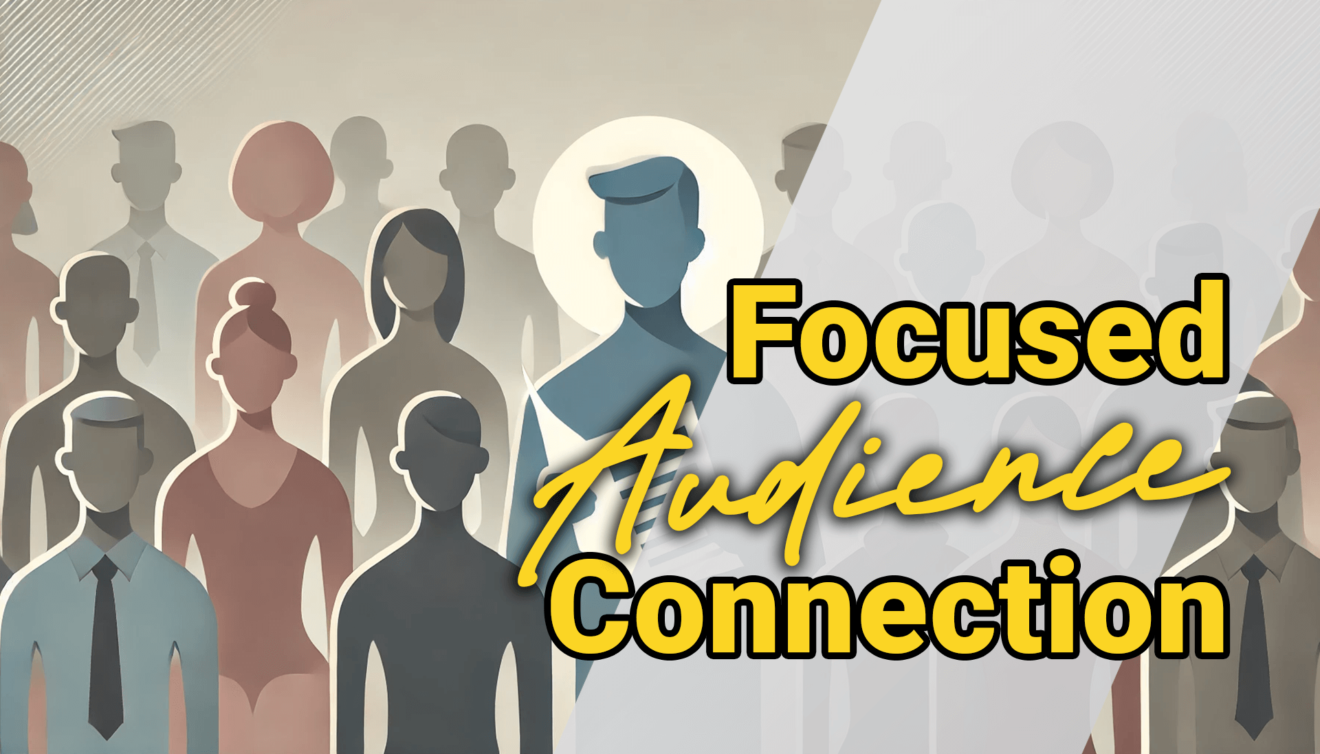
Why Flyers Still Work in Marketing
Even in the digital age, flyers remain a cost-effective and impactful way to get your message in front of the right audience. Handing them out at events, posting them on bulletin boards, or distributing them digitally through social media and email ensures your information reaches people where they are. But to truly make an impact, your flyer must be designed with purpose, clarity, and engagement in mind.
Key Elements Every Flyer Needs
Before diving into design, ensure your flyer includes all the essential components:
- Headline – A bold, attention-grabbing title that immediately tells people what the flyer is about.
- Event or Offer Details – Clearly state the what, where, when, and why.
- Call to Action (CTA) – Guide the audience on what to do next (e.g., visit your website, RSVP, claim a discount).
- Visuals – Use high-quality images or graphics that support the message without cluttering the layout.
- Branding – Include your logo, color scheme, and contact information for credibility and recognition.
How to Make Your Flyer Stand Out
1. Focus on One Goal
A flyer should communicate one clear message. Whether it’s promoting a sale or inviting people to an event, avoid cluttering it with excessive details. A single, well-defined goal will make the flyer more effective.
2. Use a Bold, Clear Headline
Your headline is the first thing people will see. Make it large, concise, and impactful. Pair it with a compelling subheading to draw people in further.
3. Keep Text Minimal
No one wants to read a wall of text. Stick to short, impactful sentences that provide just enough information to generate interest. Use bullet points to improve readability.
4. Leverage Visual Hierarchy
Organize elements in a way that naturally guides the reader’s eye from the most important information to the supporting details. The headline should be the largest element, followed by key details, then the CTA.
5. Use White Space Wisely
A cluttered flyer overwhelms the reader. White space (empty areas around text and graphics) helps separate elements, making the design more readable and visually appealing.
6. Limit Your Font Choices
Stick to two or three complementary fonts. Use one for the headline, another for supporting text, and possibly a third for accent elements. Consistency in typography makes your flyer look professional and polished.
7. Choose the Right Colors
Colors evoke emotions and influence perception. Follow the 60-30-10 rule: use 60% of a primary color, 30% of a secondary color, and 10% as an accent. Make sure the colors align with your brand and message.
8. Optimize for Both Print and Digital
Your flyer should be designed for multiple distribution channels. Use high-resolution images for print and optimize file sizes for easy digital sharing on social media and email.
Distribution Strategies for Maximum Impact
Once your flyer is ready, make sure it gets in front of the right people.
- Physical Distribution – Hand them out at relevant events, place them in high-traffic areas, or include them in product packaging.
- Digital Distribution – Share through email campaigns, social media posts, and website downloads.
- QR Codes – Include a QR code linking to a landing page, RSVP form, or special offer to track engagement.
Final Thoughts
A well-crafted flyer isn’t just about looking good—it’s about delivering a message that resonates with your audience. By focusing on clear messaging, strong visuals, and strategic distribution, you can create flyers that not only catch attention but also drive action. Now it’s time to put these principles into practice and start designing flyers that get results!