Elevate Your Designs with Minimalist Principles
Do you want to create clean, impactful designs that captivate your audience without overwhelming them? Achieving minimalistic perfection in graphic design is a skill that can set you apart in a world full of visual clutter. Mastering this approach requires more than removing elements—it’s about purposeful simplicity that communicates your message effectively. These golden rules of minimal graphic design will help you strike the right balance between aesthetics and functionality.
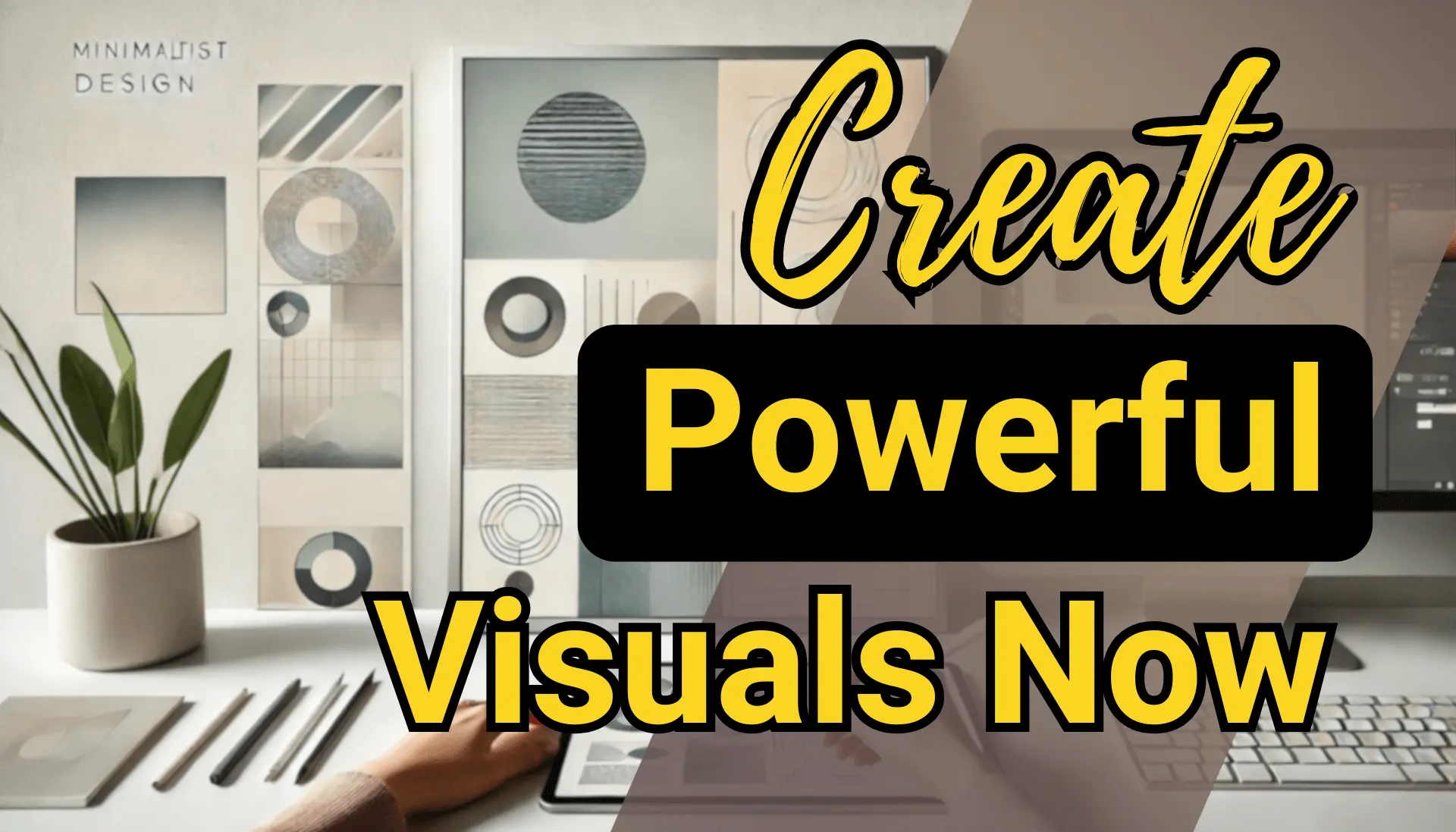
Use Imagery with Purpose
Imagery in minimal design isn’t always about filling space; it’s about enhancing the message. Strategically select visuals that serve as focal points or establish balance within the layout. A well-placed image can guide the viewer’s attention and complement typography.
- Keep it simple: Opt for clean, easygoing visuals that avoid unnecessary details.
- Experiment with placement: Use low-opacity or blending techniques to integrate images harmoniously.
- Enhance balance: Align imagery with text elements or space to achieve a seamless design.
Think about imagery as a storytelling tool, whether it’s centered, asymmetrical, or tucked into the background.
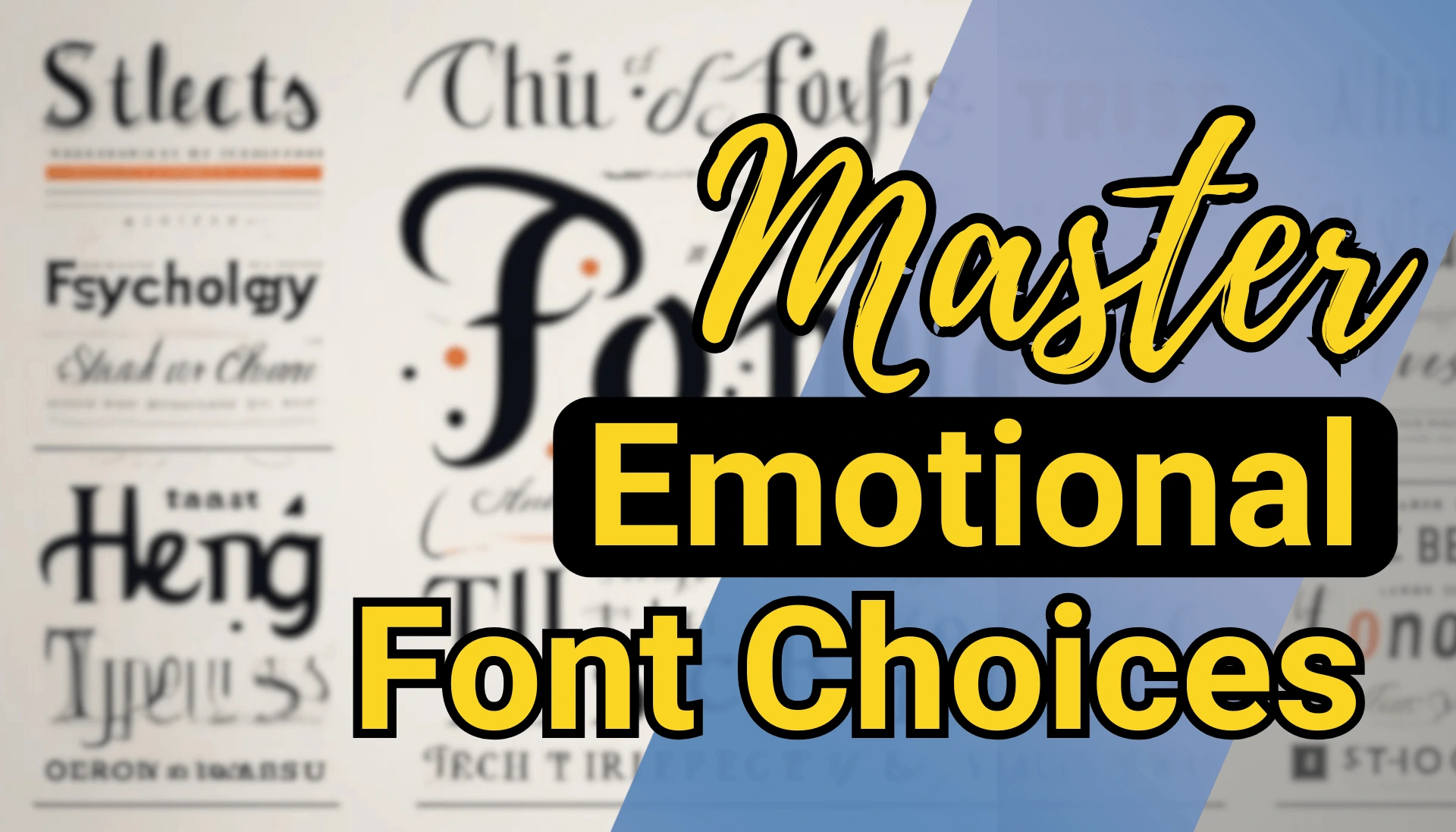
Master Typography
Typography is the backbone of any minimal design. With fewer competing elements, your font choices take center stage, making it essential to choose wisely.
- Keep it readable: Select clean fonts and avoid overly decorative styles.
- Use contrast effectively: Pair two font families to create hierarchy and visual interest.
- Experiment carefully: Adjust sizes, weights, or styles to draw attention to key messages while maintaining clarity.
Treat typography like the star of the show. Whether it’s a bold headline or subtle body text, it must balance style and functionality.
Choose Colors with Intention
Color selection in minimal design is about striking a balance between simplicity and impact. A limited palette can make a powerful statement if chosen thoughtfully.
- Start with black and white: These neutral tones create a solid foundation for most designs.
- Add a single accent color: Use a bold or complementary hue to highlight important elements.
- Think about mood: Ensure your colors align with the theme and message of the design.
Contrast is key. High-contrast colors can guide the viewer’s eye and create a dynamic aesthetic.
Eliminate the Unnecessary
Minimal design thrives on simplicity, which means every element must have a purpose. Examine each aspect of your design critically.
- Ask the right questions: Does this element improve the user’s journey or just add decoration?
- Focus on essentials: Use key elements as the focal points to draw attention where it matters most.
By refining your design to its core components, you ensure it remains both practical and visually engaging.
Achieve Visual Balance
Balance is the secret ingredient in minimal design. Without it, even the most polished designs can feel incomplete or disjointed.
- Counterbalance bold elements: Use light shapes, spaces, or small details to offset heavier components.
- Align strategically: Position elements symmetrically or asymmetrically to create harmony.
- Balance light and dark: Consider the distribution of contrasting tones across the layout.
Visual equilibrium keeps the design from feeling lopsided and enhances its overall impact.
Bring It All Together
By applying these five rules, you’ll create designs that are not only aesthetically pleasing but also functional and memorable. Remember, minimalism is not about doing less—it’s about doing more with less. Your imagery, typography, colors, and layout should work together seamlessly to deliver a clear and compelling message.
Now it’s your turn. Test these principles in your next project and watch your designs transform. Minimalism isn’t just a style; it’s a strategy for impactful communication.